


City Sleuth is an urban scavenger hunt propelling participants toward hidden cultural treasures.
BACKGROUND
Sites like Time Out, Gothamist, Thrillist, and apps like Kamino and Field Trip proved that young adults of (all ages) wanted to explore their cities, and hungered for unusual, insiders’ knowledge about their urban landscapes.
By gaming cultural exploration into a scavenger hunt, the curious would have a competitive reason to get off the couch, and onto the path less-followed.
Problem Statement
Hip urbanites want a means to find off-beat areas of their cities and the cities they visit because they would like to be more knowledgable about unusual facts and rarely visited places. We will know this to be true when we see users trigger information at those locations.
Product Solution
City Sleuth is a mobile, augmented reality app that invites users to tour different neighborhoods and collect site-specific information artifacts.
APPROACH

PHASE 1 | Understand The Player
Interviews
I conducted four scripted, F2F interviews with potential scavenger hunters. Since the app would be created for urbanites with free time, a discretionary budget and a hunger for cultural experience, and given the potential for adult content, I selected college-educated subjects over 21, skewing toward their 20s and thirties. However, it would be ill-advised to rule out retirees with a zest for experience and learning. So, I included one over-50 man.

All of the interviewees liked to explore cities in general, and New York City in particular. They all regularly sought new, out-of-the-way locations for pop culture, as well as drinks and food. Though only two had ever conducted a scavenger hunt, all the participants were enthusiastic about one dedicated to history, music, and mystery. Though they would use it to socialize with friends, and possibly with other players, they would not use it as a way of meeting people.
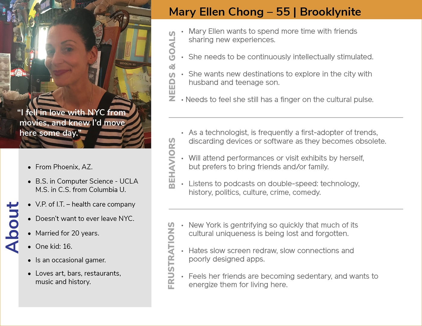
Personas
After affinity mapping key findings, and cluster mapping emerging insights, I built three personas, which would ground the task analysis for user flows.


User Flows
Generative and competitive research clearly established the fact that people prefer scavenger hunts as a social activity. While our players users wouldn’t use City Sleuths as a medium to meet others, they would like to share the experience with friends and family. With the primary business demand to book hunts, two core functions are clear:
• Finding and booking a hunt
• Inviting friends to that hunt
The order in which these tasks are conducted seemed interchangeable, (and was verified by later interviews).

PHASE 2 | DESIGN
Preliminary IA
Knowing the users needs and expectations in accomplishing core tasks, the app seemed simple to map. However, I needed to check my expectations with potential players. With an open card sort, I asked research subjects to organize functions according to their expectations. Without a common nomenclature, it was sometimes challenging to interpret and categorize creative naming conventions. Nonetheless, a similarity matrix emerged that suggested some modifications to the app structure.


Noting the grouping of hunting searching and preferences, I restructured the architecture to group these with search. Likewise, it was clear that communications with friends and other players was important.
WIREFRAMES AND PROTOTYPING
Paper sketching was my foundation for fleshing out core functions.

After concepting on paper, I built medium-res wireframes in Balsamiq. However, it became abundantly clear with the medium-res screens that duplicating functions on the home and hunt screens was at best wasteful. So, I tweaked the architecture's site map, before building a hi-res prototype.

STAGE 3 | User Testing and Revision
After building a high-res prototype on Invision, I was ready for remote and F2F moderated usability testing.

The objectives for testing were to determine if users understood the app, observe interaction for usability challenges, and note any opportunities for improvement. In 2 in-person and 4 remote sessions, subjects largely matching my personas consented to be recorded with the clickable Invision prototype.
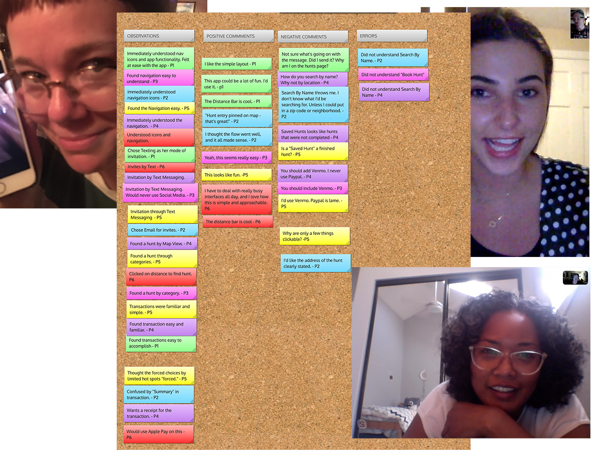
By Jakob Nielsen’s scale, the testers identified one minor usability problem, and a couple of opportunities for improvement.
• Searching for a ‘Hunt By Name” was confusing, and in the next iteration became a search by zip code or neighborhood.
• “Saved Hunts” was confusing for first time users. It opened the possibility for on-boarding with brief, descriptive text.
• Younger testers, in particular, were eager to see Venmo as a payment option.

PHASE 4: UI
Time for the visual build! Choosing a limited color palette, a Google font, and a grid system, I built out an initial style guide and first round of interface iterations.
Examining these screens for WCAG accessibility issues with tools such as ContrastChecker uncovered areas for improvement. Clicking through a prototype on Invision, design peers also strengthened my work with valuable critical input.

The combined evolution included:
• Changing top bar for both aesthetics and readability of logo
• Inclusion of page titles on all screens
• Removal of non-functional, decorative photography on all but hunt details pages
• Removal of outlines from global nav icons, and inclusion of text to aid text-to-speech readers
• Increased contrast for category card names
• Replacement of proximity bar forward triangle with “GO” button.

View the current prototype: https://invis.io/SVTB98UFC4Y
Into The Future: Next Iteration
A player content rating system would not only evaluate the features on existing hunts, but also provide invaluable insight into the development of new areas for business development. Pain points would be quickly identified and solutions delivered. At the same time, consumers would feel a sense of ownership toward the app; well-reviewed hunts would see an increase in traffic; and poorly-reviewed hunts or features would be quickly retired.
A star-system would provide quantitative data about a hunt, while written reviews would offer deeper insights into the player needs.
Hypothesis:
Our hunts will improve through player feedback by growing popular content areas and eliminating pain points.
We will know this to be true when player ratings correspond with increased traffic to well-reviewed hunts.
User-testing
Moderated user testing should determine if reviews dialogues should be left largely for the user to fill out as they see fit, or if there should be prompting for specific player input (eg., “What I liked,” or “What I’d like to see”).
Iteration Timeline: 9-12 weeks
UX and testing should take 2 weeks, with evaluation and improvement requiring another two-week sprint. UI should require a week, including refinement, with developers requiring four weeks. Another round of testing will uncover any challenges to be addressed before a version update.


